
Views: 218 Author: Miluo Smart Home Publish Time: 2026-11-11 Origin: Site


Content Menu
● What Makes a Gray Bathroom Vanity Timeless?
● Understand Gray Undertones Before Choosing a Vanity Color
>> Warm Gray and Greige Bathroom Vanities
>> Cool Gray Bathroom Vanities
>> Near-Neutral Gray Is Still Context Dependent
● Match Gray Vanity Shades to the Bathroom's Materials
>> Start with the Least Replaceable Surface
>> Coordinate Without Matching Everything
● Test Bathroom Lighting Before Approving the Gray
>> Check Daylight and Evening Light
>> Use the Actual Fixtures Where Possible
● Choose the Right Gray Finish, Not Just the Right Shade
>> Matte and Low-Sheen Finishes
>> Satin and Glossier Finishes
>> Painted Gray Versus Gray Woodgrain
● A Five-Step Sample Approval Process
● An OEM and ODM Gray Vanity Specification Checklist
>> Agree on Color Tolerances Rather Than Assuming Them
● Three Gray Vanity Design Directions to Explore
>> Crisp Contemporary Bathroom
● Develop Your Custom Gray Vanity with Miluo
>> What is the best gray for a timeless bathroom vanity?
>> Will a gray bathroom vanity look dated?
>> Is warm gray better than cool gray for a small bathroom?
>> Can I select a vanity color from an online photograph?
>> Should the vanity match the gray floor exactly?
>> How can buyers improve consistency across wholesale orders?
Choosing the right gray for a timeless bathroom vanity design starts with three decisions: undertone, lighting, and material coordination. A gray bathroom vanity should connect naturally with the countertop, flooring, walls, and hardware—not simply look attractive on a color card.
My recommendation is to treat gray as a relationship rather than a standalone color. A shade that looks balanced beside white ceramic may appear blue against cream tile. Another may feel sophisticated in daylight but unexpectedly muddy beneath evening lighting.
For homeowners, this means testing before committing. For overseas brands, wholesalers, and manufacturers, it also means translating an attractive sample into a repeatable production specification.
The goal is balance: enough character to feel intentional, enough flexibility to accommodate future changes, and enough manufacturing clarity to preserve the approved appearance.

No color is guaranteed to remain fashionable forever. However, a gray vanity can support a long-lasting bathroom design when its undertone, proportions, and surrounding materials work together.
A useful starting point is to ask:
- Does this gray complement the permanent surfaces?
- Does it remain appealing under the actual bathroom lighting?
- Can the cabinet design accommodate different accessories?
- Can the finish be reproduced consistently?
Simple door profiles and restrained material combinations make future updates easier. Towels, mirrors, and cabinet handles can change without requiring a new vanity.
My design preference is to give gray one clear role: either a quiet foundation or a deliberate focal point. Problems arise when the cabinet, flooring, countertop, and walls all compete for attention.
Gray is not one uniform neutral. Its underlying color influences whether a bathroom feels warm, cool, earthy, or crisp.
Warm grays lean toward beige, brown, or yellow. Greige combines gray and beige, although the balance varies considerably between finishes.
These shades are useful starting points for bathrooms featuring:
- Cream or ivory tiles.
- Warm white countertops.
- Oak or walnut accents.
- Brushed brass or bronze hardware.
A warm gray bathroom vanity can soften a highly polished interior without introducing a strong decorative color.
However, "warm gray" is not a precise production specification. One supplier's warm gray may appear noticeably browner than another's. Always approve a physical finish sample.
Cool grays often reveal blue or green undertones. They can complement crisp whites, restrained stone patterns, and cooler metal finishes.
They are worth exploring when a bathroom already contains blue-gray veining or cool-toned porcelain.
The risk is selecting the cabinet independently of the floor. A blue-gray vanity beside yellow-beige tile can create a contrast that feels accidental rather than deliberate.
Even a seemingly neutral gray can shift visually beside stronger colors.
Place several gray samples together and the differences become easier to see. One may suddenly appear violet, another green, and another beige.
For reliable selection, compare each candidate with the actual countertop and tile—not only with other gray swatches.
The following combinations are design starting points, not universal rules. Confirm them with physical samples.
| Gray vanity direction | Materials to explore | Hardware options | Main caution |
|---|---|---|---|
| Light warm gray | Ivory tile, pale oak, warm white tops | Brushed brass, soft nickel | Avoid a competing pink or yellow cast |
| Medium greige | Limestone-look porcelain, walnut, cream surfaces | Bronze, brass, nickel | Check that the palette does not become muddy |
| Soft cool gray | Crisp white tops, blue-gray veining | Chrome, brushed nickel | Compare carefully with warm flooring |
| Deep charcoal | Pale countertops, wood accents, light walls | Brass, nickel, selected black finishes | Provide enough visual separation |
| Muted green-gray | Natural wood, soft whites, earthy tile | Brass, bronze, nickel | Verify that the green undertone is intentional |
If the flooring is already installed, use it as the starting point. If the countertop has prominent veining, coordinate the cabinet with that pattern before choosing accessories.
This sequence reduces the risk of selecting a beautiful cabinet finish that conflicts with an expensive permanent surface.
Avoid judging compatibility from material names alone. Two products described as "white marble look" may have very different background colors and veining.
A timeless gray bathroom does not require gray tile, gray walls, and gray cabinetry.
A more layered approach might combine a warm gray vanity with pale walls, a lightly patterned countertop, and natural wood accessories.
Repeating an undertone creates cohesion. Repeating the same gray across every surface can remove the contrast that helps individual materials look distinctive.
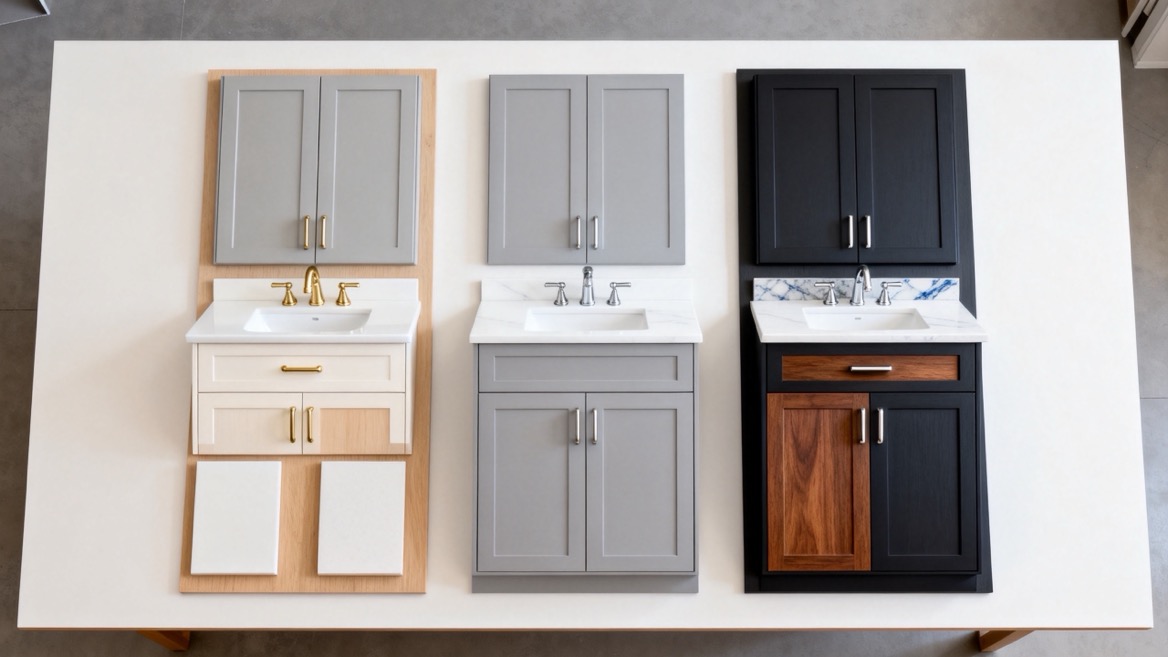
Lighting is one of the most important reasons a successful showroom color can disappoint after installation.
Evaluate samples in the room during different periods, including the time when the bathroom is used most frequently.
In Northern Hemisphere settings, north-facing daylight often makes cool undertones more noticeable. Nevertheless, window size, nearby buildings, reflected outdoor colors, and artificial lighting also affect the result.
A windowless bathroom requires a different approach: prioritize the installed lighting rather than a daylight-only sample review.
Do not assume that two lamps with the same stated color temperature will render every finish identically.
Check the vanity sample beneath the proposed mirror lighting and ceiling fixtures. Assess the cabinet alongside the basin, countertop, tile, and hardware.
Also inspect illumination across the cabinet front. Strong shadows can make one drawer appear darker than another even when their finishes match.
Metamerism occurs when two samples match under one light source but differ under another.
This matters when a vanity combines painted panels, laminated components, or separately manufactured accessories.
For commercial orders, evaluating adjacent parts under multiple relevant light sources helps reveal mismatches before shipment. Instrumental measurement and controlled visual assessment provide complementary information.
Color approval is incomplete without surface approval.
A smooth painted panel, textured laminate, and gray-stained veneer may share a similar color direction but produce different visual effects.
Low-sheen finishes can support a restrained, contemporary appearance. However, matte does not automatically mean fingerprint resistant, scratch resistant, or easy to clean.
Request the coating supplier's care instructions and relevant performance information.
Also inspect the finish under side lighting. Texture variations may be more noticeable across a wide drawer front than on a small sample.
Satin and higher-gloss finishes reflect light differently and may make the same color appear different from a matte equivalent.
For this reason, a color code alone cannot fully describe the approved appearance.
Record the sheen, texture, substrate, and coating system alongside the color reference. Where gloss is measured, specify the measurement conditions rather than using "satin" as the only acceptance criterion.
Painted gray creates a more uniform visual field. Gray-stained or woodgrain surfaces introduce pattern and variation.
Neither is automatically more luxurious or durable. The appropriate choice depends on the design, substrate, finishing system, and maintenance requirements.
For natural veneer, agree on acceptable grain and color variation before production. Expecting identical-looking panels can conflict with the character of a natural material.
This practical workflow connects design selection with purchasing decisions.
1. Gather the permanent materials. Include actual countertop, flooring, wall tile, basin, and hardware samples.
2. Shortlist three gray finishes. Choose meaningfully different undertones rather than several almost identical shades.
3. Review a representative cabinet component. A finished door or drawer front reveals more than a printed card, especially when edges and profiles are involved.
4. Inspect under relevant lighting. Check daytime conditions, installed artificial lighting, and transitions between them.
5. Sign and retain the approved standard. Record the sample identification, finish details, approval date, and permitted variation.
For larger orders, retain matching reference samples with both buyer and manufacturer. Photographs help document the decision, but they should not replace the physical approval standard.
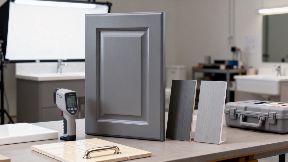
For a custom gray bathroom vanity, "match this picture" leaves too much open to interpretation.
A useful purchasing specification should include:
| Specification item | What to document |
|---|---|
| Color target | Signed physical master sample and reference code |
| Construction | Substrate, exposed edges, door profile, and component materials |
| Surface appearance | Sheen, texture, grain direction, and coating system |
| Inspection conditions | Agreed lighting, viewing method, and measurement settings |
| Acceptance criteria | Visual limits and any agreed instrumental tolerances |
| Repeat-order control | Retained standards, sample identification, and change approval |
| After-sales planning | Replacement-part references and care instructions |
Instrumental color differences are often expressed using a Delta E calculation. However, a number is meaningful only when the calculation method, instrument settings, and acceptance conditions are defined.
There is no single tolerance that guarantees an acceptable appearance for every gray vanity finish.
Adjacent doors may require closer visual agreement than components that are separated. Texture and sheen also need assessment.
A replacement drawer front should be linked to the original finish specification and production records.
Even then, an exact visual match cannot be assumed indefinitely. Existing finishes may change through exposure and use.
Discuss replacement expectations before ordering, particularly for private-label collections intended to remain available over several years.
These are illustrative concepts, not completed customer projects.
Combine a light greige vanity, warm white countertop, pale wood accents, and brushed metal hardware.
Keep the door profile simple and let texture provide interest. This direction suits buyers seeking a restrained palette without an icy appearance.
Pair a soft cool-gray vanity with white surfaces, restrained gray veining, and chrome or nickel hardware.
Check the flooring carefully. Introducing a strongly yellow-beige floor may change the intended cool, cohesive effect.
Use a deep gray cabinet against lighter walls and a pale countertop.
Introduce wood or another warm material if the composition feels severe. Check that dark handles remain visible and that lighting reveals the cabinet detailing.
Jiaxing Miluo Smart Home Co., Ltd. provides customized modern high-end bathroom products and solutions, with OEM and ODM services for overseas brands, wholesalers, and manufacturers.
To begin a gray vanity development discussion, prepare your target market, preferred dimensions, material direction, reference finishes, expected order quantity, and packaging requirements.
Request a representative finish sample and a documented approval process before confirming production. This turns "the right gray" from a subjective description into a clearer product specification.
There is no universally best shade. Start with a restrained gray that complements the permanent surfaces and remains appealing under the bathroom's actual lighting. Warm gray and greige are useful options for warm-toned interiors.
It can, particularly when the entire room depends on one strongly coordinated trend. A balanced material palette, adaptable hardware, and simple cabinet proportions provide more flexibility than color alone.
Not automatically. Room size does not determine undertone compatibility. Compare both options with the flooring, countertop, and lighting. A well-coordinated cool gray can work better than an unsuitable warm gray.
Use photographs to develop a shortlist, not to give final approval. Screens, camera processing, lighting, and surrounding colors affect the image. Approve a physical sample made with the intended surface system.
Usually, coordination is more useful than exact matching. A deliberate difference in depth or texture can help distinguish the cabinet from the floor while keeping their undertones compatible.
Retain an approved physical standard, define inspection conditions, document the finish system, and agree on acceptance criteria. Reconfirm samples when materials, coatings, or production processes change.
1. Benjamin Moore. "Gray Paint Colors." Manufacturer guidance on warm and cool undertones, gray color depth, and coordinating related colors. Supports the undertone discussion and material-pairing principles. [benjaminmoore]
2. Benjamin Moore. "Gray Paint Ideas." Guidance on comparing samples, testing colors alongside furnishings, and observing gray under different lighting conditions. Supports the sample-selection workflow and daylight discussion. [benjaminmoore]
3. X-Rite. "Two Essential Components of a Great Color Program." Explains controlled lighting, spectrophotometric measurement, and metamerism. Supports the lighting and commercial color-approval sections. [xrite]
4. X-Rite. "Color Measurement for Paints & Coatings Manufacturers." Technical brochure covering physical color standards, surface effects, standardized viewing conditions, and production color control. Supports the finish-specification and repeat-order recommendations. [xrite]


